Uniswap Bounty Program, Round 1 and 2 - March-April 2022
Stellar Submissions is a series of articles by MetricsDAO wherein we highlight bounty submission best practices by showcasing the grand prize winners of our bounty programs. Our goal with this is to sharpen the skills of on-chain analysts and raise the overall quality of bounty submissions.
In this edition of Stellar Submissions, we will highlight the grand prize winners of the first two rounds of MetricsDAO’s Uniswap Bounty Program.
Grand Prize Winners
1. Digging Deeper
Dashboard: Uniswap vs Sushiswap Active Users
Author: Treaqura
In this dashboard, Treaqura compares the behavior of Uniswap and Sushiswap users. The analyst uncovers some very interesting findings, especially with Polygon data.
It is widely known that Uniswap is the leading decentralized exchange (DEX) so when Treaqura discovered that Uniswap does not have the most users on Polygon, he looked into the other players. From here, the author saw that Uniswap’s competition was not just from Sushiswap but also from Quickswap as the latter launched way earlier than the other two.
From this, Treaqura figured out Uniswap still had the most volume, leading to a conclusion that Uniswap users were probably whales and smaller users were still on Quickswap as perhaps they were used to it already. This in fact is supported by his exploration of users that only prefer to use a single DEX wherein most Quickswap users only prefer to use Quickswap while users of the other two are more likely to use other protocols.
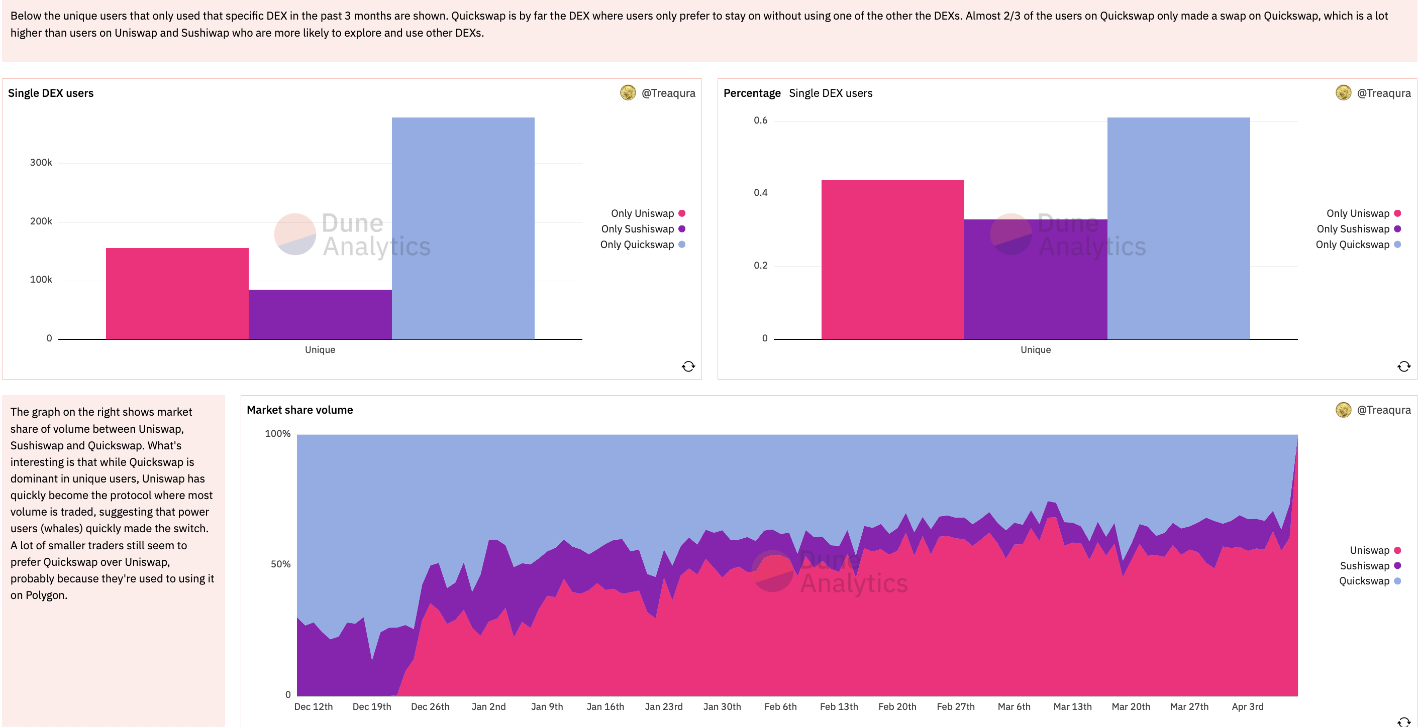
Overall, this is a great example of digging deeper into interesting findings that break initial assumptions which leads to sharing novel insights with the audience.
Check out Treaqura’s full dashboard here and give him a follow on twitter to find out more.
2. Comprehensive Complexity
Dashboard: Stablecoin Trends on Uniswap
Author: anothersmurf
This dashboard by anothersmurf explores the stablecoin trends on Uniswap. It is a great example of a comprehensive and quite complex, yet fully understandable analysis.
First, the author clearly explains the background and definitions on what stablecoins are and what role they play. Then the context is set on why the analysis is important for Uniswap and the wider crypto ecosystem. They then go deep into the methodology to give the audience confidence that the data was used properly and so that readers can possibly recreate the findings themselves.
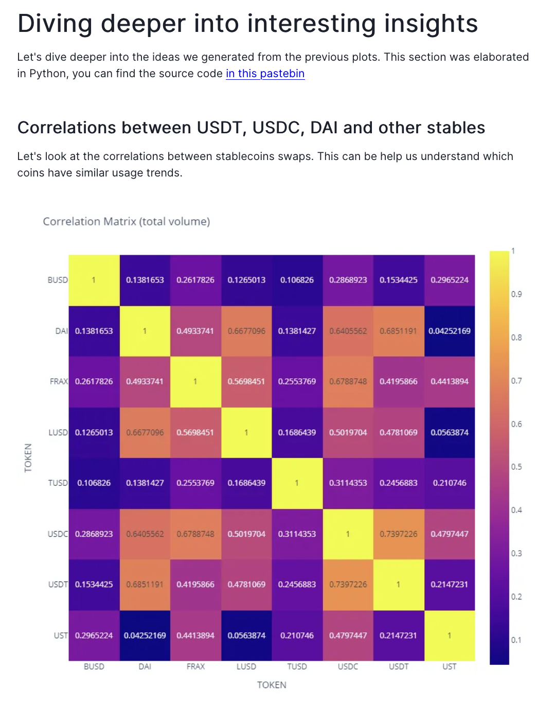
Simple metrics are then used to establish the popularity of the different stablecoins, wherein USDC and USDT stood out the most in terms of total volume and the number of swaps. From here, initial observations led to an assumption of correlation between stablecoins such as DAI, USDC, and USDT.
What’s great is that anothersmurf sought to prove his hypothesis by doing a full correlation analysis wherein there indeed was a correlation between the three stablecoins in terms of swap volume and number of swaps.
While fairly complex analyses like these are not quite the norm with your standard bounty submission, the author did an amazing job of making the analysis fully understandable for the audience. This is thanks to their clear explanation of the methodology and ability to drive a comprehensive narrative around the analysis.
See this for yourself by checking the full analysis here wherein anothersmuf goes into some interesting trend analysis as well.
3. Alternative Approach
Dashboard: Active AMM Users
Author: Adria Parcerisas
Stellar Submissions mainstay Adria Parcerisas is back again, this time looking into the active users of Uniswap and Sushiswap. He has always been good at walking the audience through his methodology and this analysis is no different.
This time around, what makes his analysis standout is the approach he took to analyzing Uniswap. The protocol is on its third version and analysts would usually take the protocol as a whole when comparing it with other decentralized exchanges like Sushiswap. However, Adria compares Uniswap v2 and v3 to one another and also to Sushiwap.
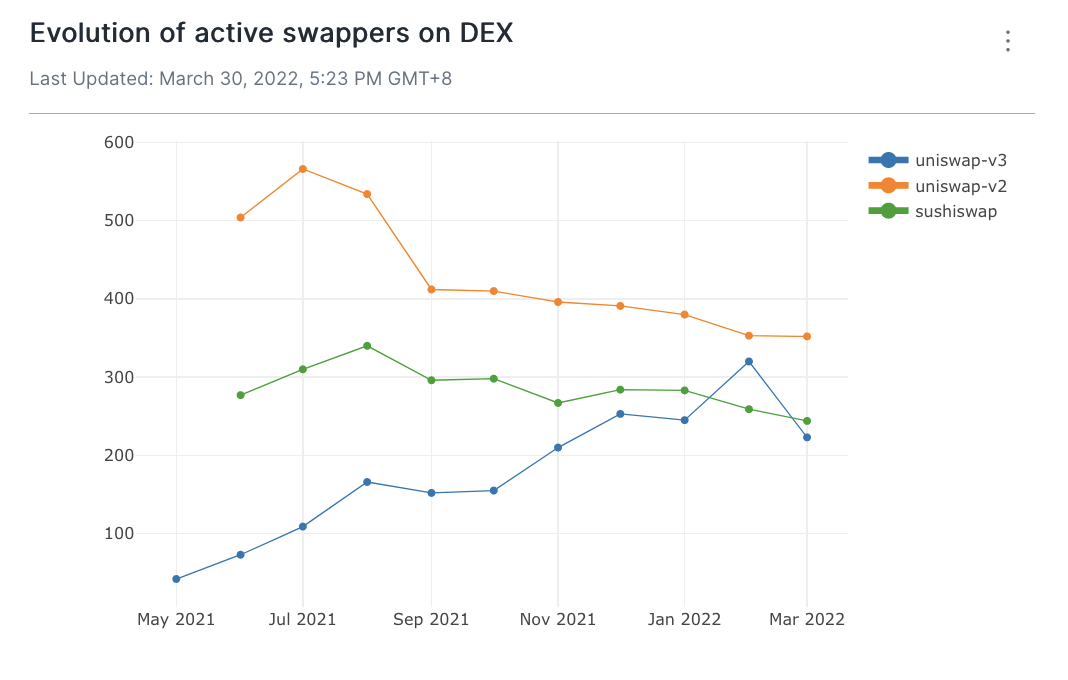
This allowed him to show the audience some trends and deviations between the three such as Uniswap v2 losing users to Uniswap v3, meaning Uniswap as a whole is maintaining its lead over Sushiswap.
Adria also dove into transaction types. Taking another unique approach, he did not count the actual number of transactions but rather the number of unique users per transaction, showing transaction diversity on a per user basis. He was able to show that users mostly seek to swap their ETH for other tokens on these DEXs.
These alternative approaches to typical DEX analyses helped Adria to uncover some unique insights and helped his submission truly standout.
You can view the full analysis here.
4. Context Comparison
Dashboard: Uniswap on Polygon - Bot Behavior
Author: rplust
For this set of bounties, I was lucky enough to be named as a grand prize winner again. In this dashboard, I explored the behavior of presumed bots on Uniswap’s deployment on Polygon. The bounty defines bots as addresses that do more than 300 swaps per month. It asks what percentage of swaps on Uniswap are done by these bots.
The solution to this bounty seems straightforward enough wherein one could simply present a chart with the share of bot swaps vs non-bot swaps. However I thought that the definition of a bot is quite arbitrary and that the audience might think the same way too. Also, given there is no standard definition for a bot to an observer (meaning the only way to find out is to perhaps ask the contract creator itself), other people might have different definitions as well. If each person had various definitions then the analysis falls apart since for them, I was not analyzing the behavior of a bot.
Therefore I found it necessary to set the context and compare the behavior of a bot, as defined by the bounty, to the behavior of non-bots. My approach was to compare the behavior in terms of key metrics such as swap volume, number of transactions, and average transaction size.
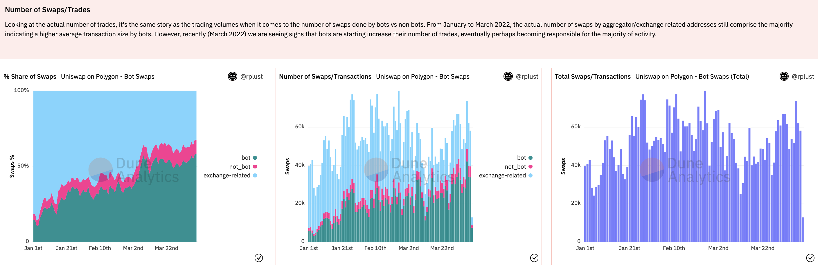
My goal was to help the audience see how much these bots standout from regular users and give the definition of a bot itself some more credibility. Once the definition has more credibility, then the analysis stands on more solid ground. From this I was able to find out that the average trade size of a bot is almost 60% higher than a non-bot/regular user and that less than 1% of all traders are bots.
You can check out the full dashboard here. I would love to hear your feedback as well.
3 Key Takeaways
-
Take a unique approach
You might be lulled into thinking there are “standard” ways to analyze blockchain data. It is true that there might be some standards like when analyzing smart contract methods and functions as defined, the fact is that on-chain analytics is a relatively new space and there is much more to be explored. While it might be risky to go against the norm, some of the best insights can only be uncovered when taking a different approach as shown by the previous submissions. This approach can range from what data you use, how you use it, and even to the tool used itself.
-
Increased complexity needs to be met with a clear methodology
The more complex an analysis, the clearer your methodology needs to be presented. As you dig deeper into your findings and take on more unique approaches to your analysis, it is important that you do not forget to explain your methodology. Make sure that you record this as you go along and have a clear and concise explanation of it in the bounty submission itself.
-
Use the right visualization at the right time
Visualizations allow you to communicate your insights more effectively to the reader. The key is to use the right one, otherwise, the reader might not understand you at all or even worse, they get the wrong information. Bar charts are great for comparing categories and line charts are excellent for comparing values through time. Pie charts are appropriate for showing shares of a whole but only for a limited set of variables. Area charts are good for demonstrating the changing shares of a whole over time. There are plenty to choose from but you have to choose wisely.
Complete Set of Uniswap Grand Prize Winners (Round 1 and 2)
- Uniswap vs Sushiswap Active Users by Treaqura
- Uniswap - Active AMM Users by Adria Parcerisas
- Uniswap on Polygon - Bot Behavior by rplust
- Uniswap v3 Stablecoin Trends by rplust
- Stablecoin Trends on Uniswap by anothersmurf
If you are ready to take on a bounty, check out MetricsDAO’s bounty program for Olympus here.
–
Want to share your own tips and best practices? Maybe you are ready to participate in a bounty program? Hop on over to the MetricsDAO Discord or follow us on Twitter to find out more.